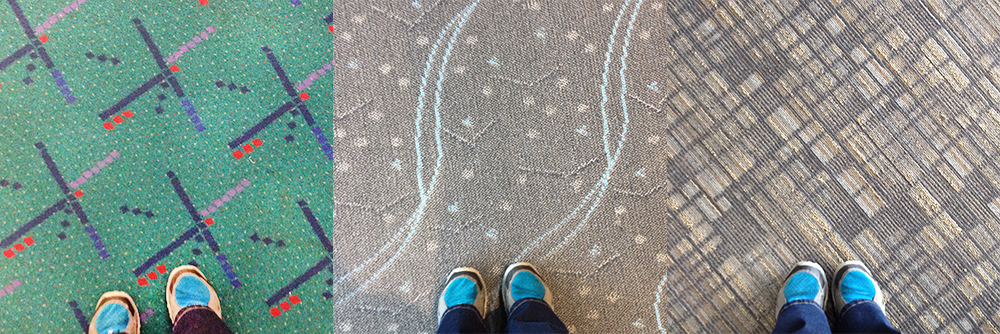
Airport carpet from Portland, OR, Denver, CO and Columbus, OH
I spent much of the day traveling from Portland to Columbus, and documented the carpet at each airport. I prefer the bright colors of the PDX carpet to the muted tones of the Denver and Columbus carpets. I could see this becoming a really fun series. You never really think about how hard airport carpet has to work when you’re running from security to your gate. It has to be durable, and the pattern has to hide stains well. Also, it doesn’t hurt to have a memorable pattern, or at least one that is not terribly ugly.
Fun facts about the PDX carpet:
» The carpet has an Instagram, Twitter and Facebook account.
» The carpet was designed in 1987 by SRG Architects. (source: A Brief History of the PDX Airport Carpet)
» The carpet design has inspired lots of products including a bike helmet, socks, mug, iPhone case, art print, mouse pad.
» You can download a wallpaper for your iPhone, courtesy of Shawna X. Huang
» The airport carpet is being replaced with a new design, with an expected completion in 2015 – 2016.
» Some PDX residents are of course not happy about the change.
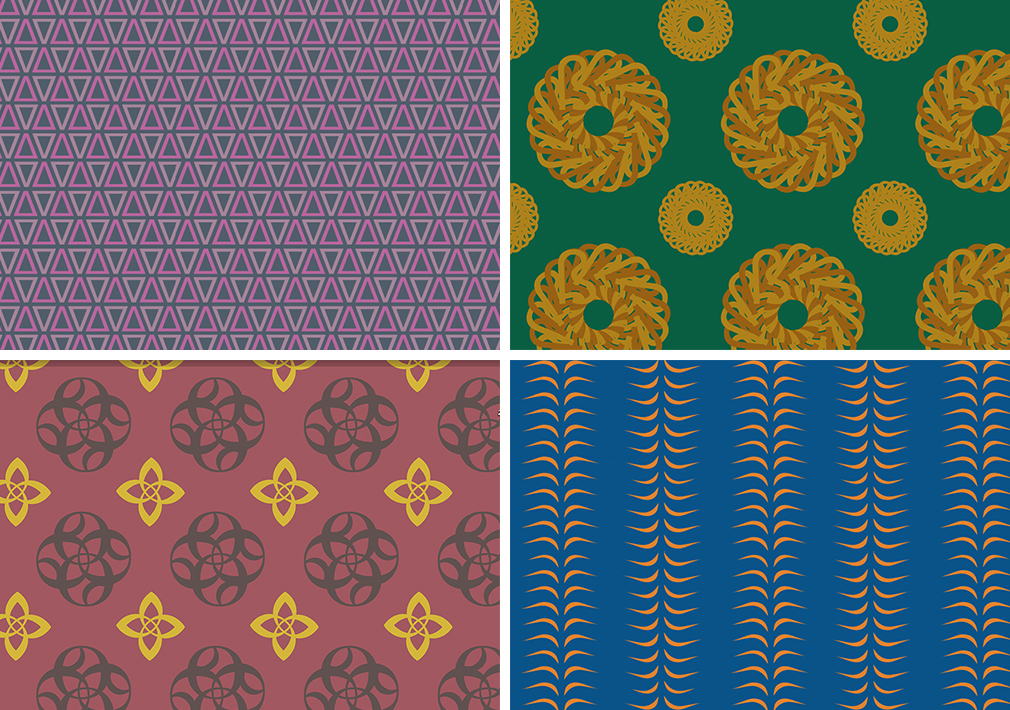
One of my favorite parts of being in the Graphic Design program at PSU is being exposed to all of the different possibilities there are in design. I don’t think I ever would have thought of carpet design as a potential avenue for my creativity if I hadn’t worked on a carpet assignment as an Adobe Illustrator exercise.

For this assignment we were asked to make four carpet patterns. Each pattern was to be made out of a single character or glyph – meaning that if we chose to work with an “A”, the entire pattern had to be made out of that character, but we could manipulate it in any way that we wanted. It was a super fun assignment, and a good intro to Adobe Illustrator for me. I also learned some lessons (some frustrating) about making repeat patterns. My favorite is the one in the top left. I think the color palette is successful, and the simple pattern would make for an awesome carpet. I’m looking forward to experimenting with more of these patterns.