Today I’m sharing the process of creating my first reduction linoleum block print from sketchbook to final print. A reduction print is made using one block (in this case linoleum) that you carve multiple times, printing in between each carving. This is a lovely step by step example. It’s also called a “suicide print”. Once you carve away areas of the block, you can’t get them back, so you only have one chance to get it right! It’s a good idea to make more prints that you think you need because getting the registration lined up is tricky, and you might ruin some in the process. On to the photos!
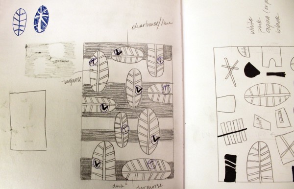
This is the sketchbook version. On the right is a bit of a sketch I thought would be too complicated for the project. I wanted something bold and graphic, and nothing with delicate lines for my first try at reduction printing. I wanted to use really bright colors (lime, turquoise or dark blue), as well as black and white for the stripes. I also decided to play with positive and negative space in the leaves.
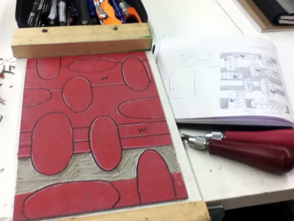
This is the first carving in process. Only the spaces marked with “W” for white were carved away. I find it’s super helpful to mark my colors with a Sharpie so that I don’t get distracted and carve away the wrong section.
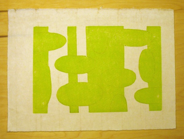
This is the first print. It was hard for me to envision how the final print would turn out at this point, but I loved the color. I used a thin handmade Japanese mulberry paper. For the assignment, we were asked to hand burnish the prints. The paper is placed over the block, and then rubbed by hand with a baren (a disc with a flat coil) until the ink transfers to the paper. Using a light Japanese paper makes it easier to hand burnish the prints.
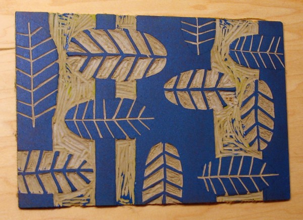
This is the second carving, inked up in blue. It was a challenge to carve away from the lines, as opposed to carving lines into the solid shapes. I’m hoping with more practice this will come easier.
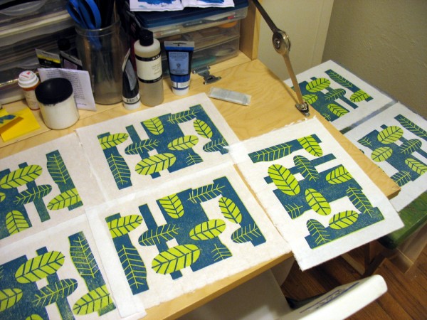
These are some of the prints drying after the second inking. Our apartment is on the small side, so just about every surface was taken over with drying prints. It was easier than I thought to register the paper for the second inking because I had marked lines on the top and bottom of the back of the paper to help me place it in the right spot. It was at this stage that I could finally see the magic in this process, and I started getting really excited about what I was making. I couldn’t wait to get started with the third color the next night.
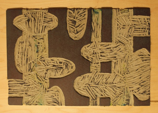
This is the last carving. Only the black lines were left, so that the leaves would be exposed in the final print. I inked up the block in black first, and did one test to see how it looked. I thought the black was very overpowering, so I mixed in a lot of white to get to a medium grey color. After the grey color was applied to the blue, it still looked black, but not an overpowering contrast. The next time I do one of these prints I will definitely test my colors first to see how they interact when layered.
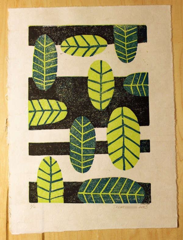
And this is the final print! I started with fifteen prints, and ruined three in the process due to printing upside down or bad registration. I narrowed it down to six of my best prints to turn in for class. Overall, I really enjoyed this process. I liked hand burnishing because I could work at home without a press. The mulberry paper is lovely, light and airy, and was fun to work with. I also really liked the planning aspect of the project. It was fun to sketch out the different layers and figure out what to carve away for each printing. I’m definitely looking forward to doing this again!
Comments 14